
To kick things off, we ranked all the existing logos because why not. We mention different eras, which we’ve loosely defined as Vintage (I-XVIII), Classic (XIX-XXVII), Modern (XXVIII-XXXIX), Postmodern (XL-XLIV), and the Dark Ages (XLV-LIV) based on prominent demarcations in design philosophy and messaging.
Note: The logos for SBs I-IV were revised after the fact, so we’ve covered the logos that the league defines as official on its website.

wikipedia.org
57. Super Bowl LIV
After adopting the template system, the league didn’t even commit to sticking to it. Why did they change the font? Maybe it’s nicer than the last three, but not having the courage to stick to weak convictions is… well… weak.

nfl.com
56.–54. Super Bowls LI–LIII
Using the font that was developed for the league (which may actually be called “NFL”) is solid brand consistency, but it’s also staid and boring. At least there’s some color in these? What’s really confusing is the decision to place “Super Bowl” beneath the numerals. There’s plenty of brand recognition here, but to consciously go with, effectively, “51 Super Bowl” and to iterate on it? Odd.
nfl.com
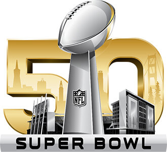
53. Super Bowl 50
To us, yes, it’s a difficult design challenge to use just an L, but this edges on garish. Embellishing all that silver with gold… gross. Couple that with the shrug emoji of a cop out of “50” and here we are.

wikipedia.org
52. Super Bowl LV
You know what? The numerals here are kinda pleasing to look at. They compel us to ask why the font change (again) and the texture, but then we wonder why it features Dolphins colors when the game is in Tampa and lose our nerve. Then again, none of the previous four logos used colors indicative of the host team either because NOTHING MATTERS ANYMORE. (Yes, SB LIV was in Miami and the logo used vaguely Dolphins colors, but the league gets no such benefit of the doubt at this point.)
“But wait,” you say. “Is the trophy supposed to be an I? Is it Super Bowl LIV? Wasn’t last year Super Bowl LIV?”
“[loud sigh]”
nfl.com
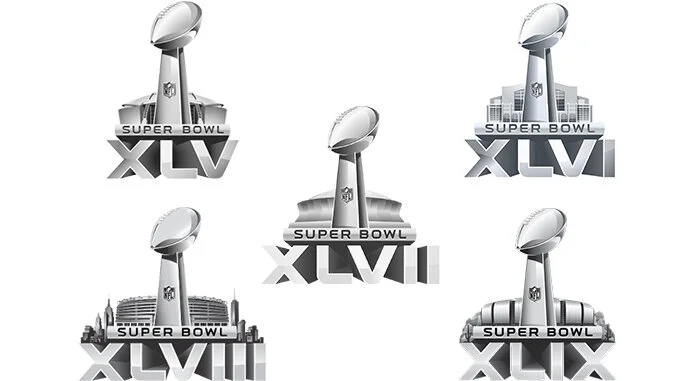
51.–47. Super Bowls XLV–XLIX
The reason we’re here in the first place. Yes, they’re technically silver, but they’re really just grey. Rendering the different stadiums helps distinguish them, but only from each other. Technically very well constructed, but creatively lifeless.
wikipedia.org
46. Super Bowl LVI
WE DID IT EVERYONE! All of us out here doing our own logos made the league look so bad that they… gave exactly one single shit more about this logo than the last 11.
They’re trying here. That deserves some credit, but not much. The horizontal bar of the L is the same length as the stem, which isn’t necessarily a typographical sin, but it is pretty awkward. At least the logo clues us in to where the game is being played: Hawaii.
45. Super Bowl LVII
Hey now! There’s some cool stuff going on here. Riffing on the state flag, applying that interestingly over the canyon, moving the trophy so the space between the L and V isn’t as awkward. Unfortunately, those open up some color and contrast issues. Still… progress!

nfl.com
44. Super Bowl XVIII
The nadir of the pale blue/red color scheme that straddles the Vintage and Classic eras. The contrast is rough and reminds us of old mimeograph paper in school (we’re old!) and the ribbon should to behind the last roman numeral on the right. The font looks like it was lifted from Rocky and Bullwinkle (we’re so old!).
nfl.com
43. Super Bowl I
Not a logo, really. Interesting typography, but could we fill in the “AFL” and “NFL?”
nfl.com
42. Super Bowl XXII
Much like SB XXIII, seems like it’s halfway finished, and the red-on-blue contrast problems that run through the Classic era are here, too. Considering so many sizes is a modern thing, but the thin white outlines around the numerals create too much tension instead of contrast.
nfl.com
41. Super Bowl XI
This would be higher on the list if the typography treatment hadn’t been on the fourth iteration of this single-line layout. Drop caps are cool though.

nfl.com
40. Super Bowl XLIV
Maybe it’s because this is the last of the unique logos, but this feels like the league was just running on fumes. The Postmodern era featured field elements more and more prominently, but why? It was a little awkward.
nfl.com
39. Super Bowl VII
Another single-line layout in the Vintage era. While this doesn’t use the same font/numeral scheme, it does dilute the fantastic take from SB V significantly. Also, that color contrast. Yeesh.
nfl.com
38. Super Bowl XV
The typography is flat, and the colors are as bland as the overall concept. By this time, there had been some genuinely creative versions, so this must have been a letdown.
nfl.com
37. Super Bowl XVI
Solid typography, but low on concept again. We don’t love the slab serifs, but it’s a step up from the previous game.
nfl.com
36. Super Bowl VI
We know it’s far more of the time, but the gilded typography is… woof. Sure, the gold goes along with the theme and location, but we don’t have to like it.
nfl.com
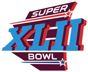
35. Super Bowl XLII
From the postmodern era suite that used the on-field elements, but what is the element? An abstracted field? Nice layout and movement, but the color scheme is a little harsh.
[Note: Readers have let us know that the mystery element is the shape of Arizona, where the game was held. We really shoulda known that. Thank you, readers!]
nfl.com
34. Super Bowl VIII
Coming toward the end of that single-line layout, which will necessitate a change. The color scheme is very stark, but points again for the drop-capped “S” and numerals.
nfl.com
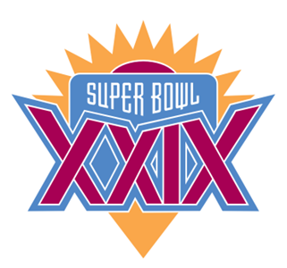
33. Super Bowl XXIX
This is a very dated color scheme, even for 1994. Visually, it’s more evocative of Arizona (or Tostitos) than Miami. The offset strokes add more tension than depth and there’s a lot of confusing choices made with their relationship to each other and the whole composition.
nfl.com
32. Super Bowl IV
Granted it’s only the fourth iteration, but the two actual logos before it were far stronger.

nfl.com
31. Super Bowl XXVI
Again with the red-on-pale-blue color scheme. Nice treatment on the football, but between the razor-thin numeral outline and the ridges, we can’t get on board.

nfl.com
30. Super Bowl XXIII
There’s a nice repetition and alignment with the diagonals, but the overall layout feels unfinished again. The typography does deserve a few points, though.
nfl.com
29. Super Bowl XVII
Leans into an Art Deco vibe nicely. The pale blue with red scheme is used much more effectively here, and the wings are a nice touch. The point of the V needs to be either shorter or longer than it is.
nfl.com
28. Super Bowl XIX
There’s a nice Deco slant here too, and the white-on-blue treatment would have been worked better though the Classic era. Nice use of the grey to create depth.